
by Theodora Charalambous
Everyone knows the age-old saying “Don’t judge a book by its cover”, and although most of us try to implement it in our daily lives, when it comes to the book buying experience things seem to be a bit different. If you’ve ever visited a library or a book store you know quite well how tedious the process of finding the “perfect” book can be when there’s an overwhelming amount of literature and more waiting for you on the shelves. You make your way to the aisle of your preferred genre and now what? What’s the deciding factor that makes one choose a book? Let’s be honest, it’s the cover! Whether it’s a beautifully illustrated cover, a hard cover with interesting engravings on it or a very minimalistic one, the one that manages to steal your attention, is the one getting picked up first.
On this blog post, I will be discussing how the three book covers made for the novel The Time of the Ghosts, written by Jewish Australian author Gillian Polack, reflect on its story and whether or not “Don’t judge book by its cover” is bad advice.
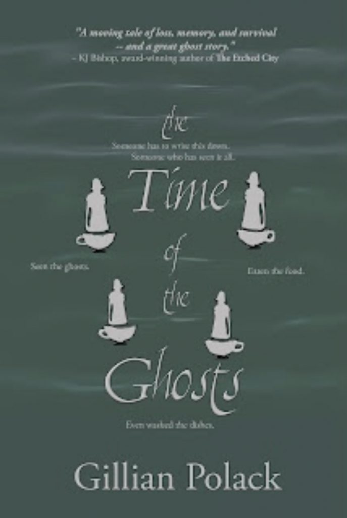
Let’s start with the original 2015 cover by Satalyte’s in-house designer, Marieke Ormsby. The design, as the writer described it, is more of a contemporary fiction cover. There is what resembles mist on top of a faded dark green background, with the main focus being four small
white figures of women, each floating on top of a white tea cup. This cover also includes the
subtitle:
Someone has to write this down.
Someone who has seen it all.
Seen the ghosts.
Eaten the food.
Even washed the dishes.
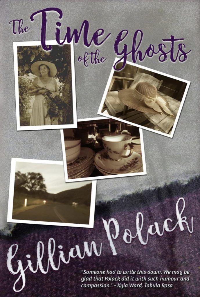
Polack‘s favorite cover edition is the second one, that was designed by Book View Cafe, more specifically by writer and cover designer Maya Bohnhoff. It consists of four photos; the very first, is one of an older woman in a white dress and a straw hat, hugging a bouquet of carrots under a tree. The other three are, a straw hat on top of a small garden table, a tea cup and lastly a picture of a road. The background is a grayish ripped cloth overlapping a deep purple one, which compliments the sepia toned photos perfectly. The cover has the writer’s personal touch, as the images of the teacup, the road and the background cloth are pictures taken by Polack herself.
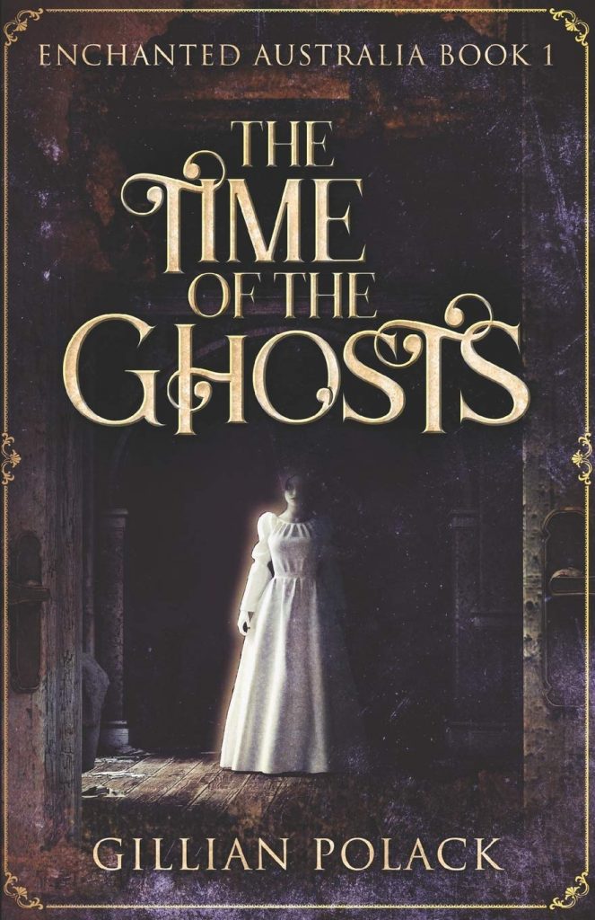
Lastly the 2021 edition cover art is by NextChapter, and the one I personally own as well as the reason behind the idea of this blog post. The book cover is outlined with a small detailed design reminiscent of a golden picture frame. Two open doors reveal a rundown corridor and its rusty wooden floor, with a single window shining light to reveal the figure of a white woman wearing a wedding dress, or perhaps a gothic Victorian nightgown. Exclusively in the 2021 edition, the phrase “Enchanted Australia Book 1” hovers above the title.
When I first got my hands on this novel, looking at the recent cover, my expectations of what the story would be about definitely did not fit the actual plot. The novel follows the lives of three elderly women and the teenage girl runaway, who they’ve taken in, as well as their adventures chasing away ghosts and other supernatural creatures to protect Canberra. The Time of the Ghosts is so much more than your typical ghost story. It’s about friendship, bonding over tea, protecting the place you call home and overcoming your own inner ghosts. The first two cover art designs, undoubtedly encapsulate the essence of the novel perfectly, the women, the tea and the hidden mysteries of Canberra.
So, should we trust book covers or not? The answer is yes…but maybe not always. Covers are usually very carefully designed and picked to provide just enough information about the book to the potential reader. For example, the cover usually indicates the genre of the book, as certain trends tend to show up more across specific categories. Consequently, some covers can be misleading, as they are designed to reel in a particular demographic that would normally not be interested in the book. In the case of The Time of the Ghosts the 2021 cover art is quite deceiving, as it leads one to suspect that the novel’s genre is horror. Additionally it can create the misconception that the novel is a part of a trilogy called Enchanted Australia. However, the reason behind this design was to sell copies on Amazon, which is why it doesn’t represent the novel’s story as closely in comparison to the first two editions. Even so, my experience reading the book was a good one, making the cover’s deception a minuscule problem, if one at all.
Most of us judge books based on a list of certain criteria and not solely on one factor. Whether that list includes the title, the author, the description and so on, we cannot dismiss the importance of the cover design. Perhaps, next time you’re looking to bring a book home, try choosing it simply by its cover.
Images Used
Ormsby, M. J. (2015). The Time of the Ghosts cover art, 1st edition [Illustration]. The History Girls. https://the-history-girls.blogspot.com/2016/02/discovering-what-characters-eat-gillian.html?m=1
Bohnhoff, M. (2018). The Time of The Ghosts cover art, 2nd edition [Book cover]. Amazon. https://www.amazon.com/Time-Ghosts-Gillian-Polack/dp/1611387205
NextChapter. (2021). The Time of the Ghosts cover art, 3rd edition [Illustration]. Amazon. https://www.amazon.com/Time-Ghosts-Enchanted-Australia-Book/dp/103456353X